
[무작정 만들어보기] ListBox Control과 ListBoxItem Control

ListBox Control를 이용해서 간단한 위와 같이 만들어 보겠습니다. 전에 어떤 분이 훈스닷넷에 질문을 오려주신 내용인데요. 그때 만들었던 예제 소스입니다. 그럼 설명 필요 없이 소스부터 천천히 보면서 알아 보도록 하지요.
|
ListBox Control |
|
<ListBox x:Name="DemoList" HorizontalAlignment="Left" ScrollViewer.HorizontalScrollBarVisibility="Hidden" ScrollViewer.VerticalScrollBarVisibility="Hidden" VerticalAlignment="Stretch" Cursor="Hand" Style="{StaticResource DemoListBoxStyle}" ItemContainerStyle="{StaticResource DemoListBoxItemStyle}"> </ListBox> |
일단 ListBox컨트롤을 하나 생성합니다. 저는 ScrollViewer의 속성을 다 Hidden으로 잡았습니다. 스크롤이 안보이도록 한거죠. 또 코드를 보시면 Style과 ItemContatinerStyle에 StaticResource로 스타일이 잡혀있는 것을 볼수가 있을 겁니다. 그럼 저 스타일쪽에 움직임의 답이 있지 않을까... 하는 생각이 바로 드실겁니다.^^ 그렇게 생각하셨던 분들이라면 역시 대단하신 분들이 아닐까 감히 생각해 봅니다.
그럼 일단 Style 소스를 보도록 하지요.
|
Style Source |
|
<Style x:Key="DemoListBoxStyle" TargetType="ListBox"> <Setter Property="ItemsPanel"> <Setter.Value> <ItemsPanelTemplate> <!-- 리스트박스의 페널은 스텍페널 입니다. Orientation : Horizontal--> <StackPanel Orientation="Horizontal" VerticalAlignment="Stretch" HorizontalAlignment="Center" /> </ItemsPanelTemplate> </Setter.Value> </Setter> </Style> |
위 Style 코드는 짧지요. 모.. 이정도쯤은 손으로 짜도 짤수 있지 않을까 생각해드네요. Style을 만들고 key 이름만 지어주고,TargetType 지정해주고, ItemsPanel 속성을 StackPanel로 지정하고...정말 눈으로 봐도 직관적 으로 알수 있지 안나요. 결론적으로 저는 ListBox의 ItemsPanel속성을 StackPanel에 Orientation은 Horizontal로 사용하고 있을 알수 있을 것입니다. 이렇게 한다면 리스트 아이템이 가로로 나타나겠지요.
그럼 이제 ItemContatinerStyle 소스를 보도록 하겠습니다.
|
ItemContatinerStyle Source |
|
<Style x:Key="DemoListBoxItemStyle" TargetType="ListBoxItem"> <Setter Property="Padding" Value="1"/> <Setter Property="HorizontalContentAlignment" Value="Left"/> <Setter Property="VerticalContentAlignment" Value="Top"/> <Setter Property="Background" Value="Transparent"/> <Setter Property="BorderThickness" Value="1"/> <Setter Property="TabNavigation" Value="Local"/> <Setter Property="Template"> <Setter.Value> <ControlTemplate TargetType="ListBoxItem"> <Grid x:Name="grid" Width="20" Background="{TemplateBinding Background}"> <vsm:VisualStateManager.VisualStateGroups> <vsm:VisualStateGroup x:Name="CommonStates"> <vsm:VisualStateGroup.Transitions> <vsm:VisualTransition GeneratedDuration="00:00:00.1000000"/> <vsm:VisualTransition From="Normal" GeneratedDuration="00:00:00.1000000" To="MouseOver"/> </vsm:VisualStateGroup.Transitions> <vsm:VisualState x:Name="Normal"/> <vsm:VisualState x:Name="MouseOver"> <Storyboard> <DoubleAnimationUsingKeyFrames BeginTime="00:00:00" Duration="00:00:00.0010000" Storyboard.TargetName="grid" Storyboard.TargetProperty="(FrameworkElement.Width)"> <SplineDoubleKeyFrame KeyTime="00:00:00" Value="50"/> </DoubleAnimationUsingKeyFrames> </Storyboard> </vsm:VisualState> <vsm:VisualState x:Name="Disabled"> <Storyboard> <DoubleAnimationUsingKeyFrames Storyboard.TargetName="contentPresenter" Storyboard.TargetProperty="Opacity"> <SplineDoubleKeyFrame KeyTime="0" Value=".55"/> </DoubleAnimationUsingKeyFrames> </Storyboard> </vsm:VisualState> </vsm:VisualStateGroup> <vsm:VisualStateGroup x:Name="SelectionStates"> <vsm:VisualState x:Name="Unselected"/> <vsm:VisualState x:Name="Selected"> <Storyboard/> </vsm:VisualState> </vsm:VisualStateGroup> <vsm:VisualStateGroup x:Name="FocusStates"> <vsm:VisualState x:Name="Focused"> <Storyboard/> </vsm:VisualState> <vsm:VisualState x:Name="Unfocused"/> </vsm:VisualStateGroup> </vsm:VisualStateManager.VisualStateGroups> <ContentPresenter HorizontalAlignment="Stretch" Margin="{TemplateBinding Padding}" x:Name="contentPresenter" VerticalAlignment="Stretch" Width="Auto" Content="{TemplateBinding Content}" ContentTemplate="{TemplateBinding ContentTemplate}"/> </Grid> </ControlTemplate> </Setter.Value> </Setter> </Style> |
와~정말 소스가 기네요. 이정도면 손으로 작성하는것 보다는 블랜드를 이용하는 것이 좋겠네요. ItemContainerStyle은 아이템 항목 컨테이너에 적용될 스타일을 지정합니다. 일단 아래 그림을 통해 블랜드로 어떻게 만들었는지 확인 해보록 하지요.
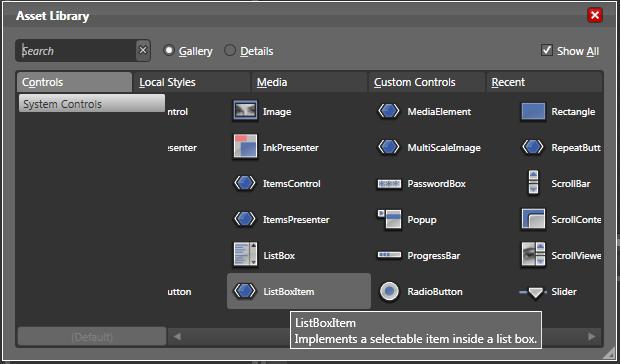
그럼 아래 그림과 같이 Control들 중에서 ListBoxItem를 선택하도록 합니다.
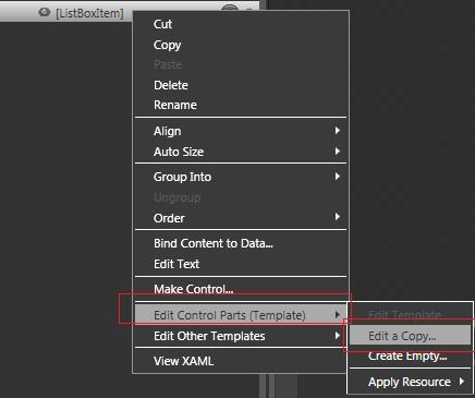
ListBoxItem컨트롤을 더블 클릭하면 블랜드 화면에 생성된 것을 확인 하실수 있습니다. 그럼 마우스 오른쪽을 클릭해서 Edit Control Parts(Template) >> Edit a Copy.. 를 클릭합니다. (아래 그림 참고)
그럼 아래와 같은 화면이 나타날 텐데요.
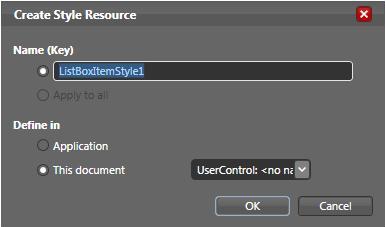
위 Name(key)에 스타일을 이름을 설정해 주도록합니다. 그리고 Application쪽에 스타일을 둘 것인 것 아니면, 현재 페이제에 스타일을 둘 것인지를 선택합니다. 범용적으로 사용되어야 할 스타일이라면 Application쪽에 두는 것이 좋겠지요. 일단 아무데나 선택을 하고 OK를 클릭하세요.
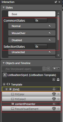
위 그림과 같이 저는 필요없는 Rectangle을 잡아서 삭제 해버렸습니다. 그냥 ContentPresenter만 남겨두었지요. ContentPresenter는 지우면 안될 녀석입니다. 주의 하세요. 그리고 Grid를 선택하고 위의 MeuseOver상태일때와 Normal, Disabled 상태일때 각각의 크기를 지정해 주도록 합니다. 이렇게까지 하면 끝입니다.
이제 테스트 할 수 있는 아이템을 .cs단에서 만들어서 테스트 해보면 되겠네요.
테스트 아이템은 아래와 같습니다.
|
Test Code |
|
List<Rectangle> items = new List<Rectangle>() { new Rectangle(){Fill = new SolidColorBrush(Colors.Red)}, new Rectangle(){Fill = new SolidColorBrush(Colors.Yellow)}, new Rectangle(){Fill = new SolidColorBrush(Colors.Orange)}, new Rectangle(){Fill = new SolidColorBrush(Colors.Green)}, new Rectangle(){Fill = new SolidColorBrush(Color.FromArgb(100,213,236,191))}, new Rectangle(){Fill = new SolidColorBrush(Color.FromArgb(100,253,218,180))}, new Rectangle(){Fill = new SolidColorBrush(Color.FromArgb(100,165,149,185))}, new Rectangle(){Fill = new SolidColorBrush(Color.FromArgb(100,138,42,4))}, new Rectangle(){Fill = new SolidColorBrush(Colors.Blue)}, new Rectangle(){Fill = new SolidColorBrush(Colors.Black)} }; DemoList.ItemsSource = items; |
여기까지 하셨다면 위와 같은 컨트롤이 만들어 졌을 겁니다.
지금까지 읽고 따라해주셔 감사합니다~!
 invalid-file